
Back to Blog html
html
The Fan Spread with
Positioning Each Card with
Click-to-Focus with Exclusive
 gemma
gemma community
 ai
ai ai
ai githubactions
 ai
ai
Re-creating a Pantone Color Deck in CSS
Mads Stoumann February 11, 2026
0 views
If you’ve ever held a Pantone fan deck — the kind graphic designers used to carry around like a...
If you’ve ever held a Pantone fan deck — the kind graphic designers used to carry around like a sacred artifact — you know the satisfying way those cards fan out from a single rivet point. Each card swings on its own arc, and you flip through the colors by hand.
I wanted to recreate that experience for this week’s CodePen challenge, which is all about color palettes.
Follow along as we build a fully interactive color fan deck where the spread adapts to the container width, cards know their position among their siblings, and clicking a card to "focus" it is handled entirely by the browser’s native <details> element.
No JavaScript! Let’s dive in!
The Markup
Our fan deck is a <section> containing a cover card, followed by color cards, each wrapped in a <details> element:
<section>
  <!-- cover card -->
  <details name="deck">
    <summary>Reds <span>×</span></summary>
    <ul>
      <li style="--c: lab(45% 67 30)">
        <strong>Poppy Red</strong>
        <dl>
          <dt>HEX</dt><dd>#DC3D4C</dd>
          <dt>RGB</dt><dd>220, 61, 76</dd>
          <dt>LAB</dt><dd>45, 56, 25</dd>
        </dl>
      </li>
      <!-- more colors -->
    </ul>
  </details>

  <details name="deck">
    <summary>Blues <span>×</span></summary>
    <!-- ... -->
  </details>

  <!-- more cards -->
</section>
A few things to note:
- The cover card doesn’t toggle — it just sits at the front of the deck.
- Each color card is a
<details name="deck">element. Thenameattribute is the key — it makes them an exclusive accordion. Only one can be open at a time, and clicking the open one closes it. - The
<summary>serves as both the card label and the click target.
Not much to see yet. Let’s add some CSS:
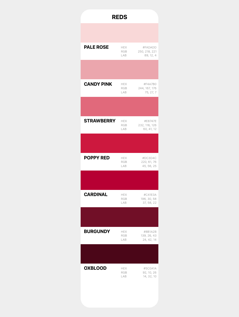
I won’t go into the CSS in depth here; it’s simply a <ul> with the color values defined in a <dl> and wrapped up in a grid.
Stacking the Deck
First, we need all cards to occupy the same grid cell, stacked on top of each other:
section {
  container-type: inline-size;
  display: grid;
  place-items: end center;
}

section > * {
  grid-area: 1 / -1;
  z-index: calc(sibling-count() - sibling-index());
}
Setting container-type: inline-size on the <section> lets us use container query units later. Every direct child is placed in the same grid cell with grid-area: 1 / -1, creating a stack.
The z-index line uses two new CSS functions — sibling-count() and sibling-index() — to ensure the first card sits on top. The first child has sibling-index() of 1, so it gets the highest z-index. The last child gets 1. Natural stacking order — no hardcoded values, no counters, no JavaScript.
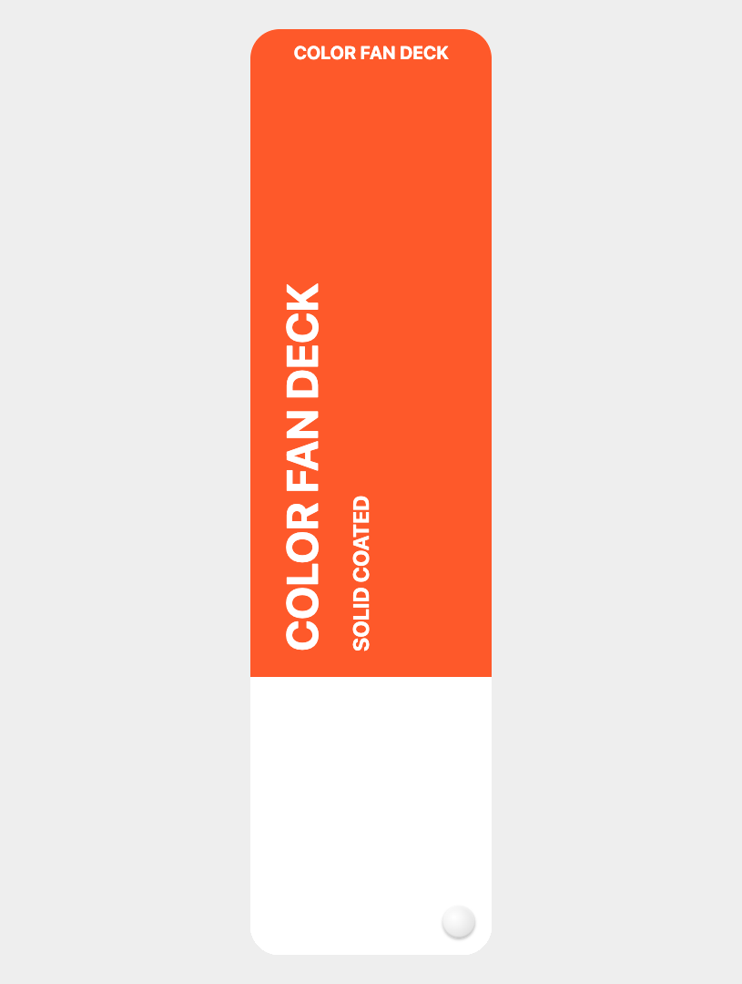
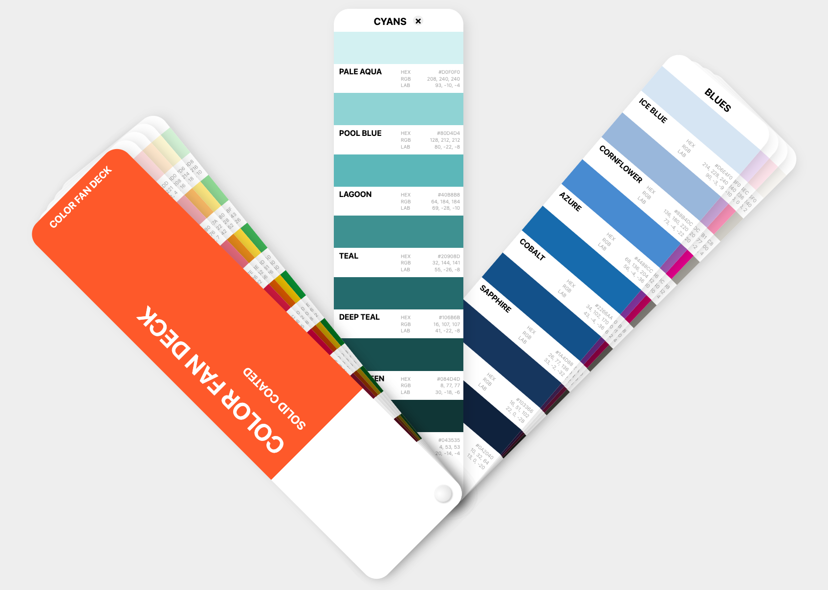
So, for now, we just see the cover card — the color cards are hidden behind it (the rivet is an ::after pseudo-element with a radial-gradient):
The Fan Spread with progress()
This is where it gets interesting. A real fan deck spreads wider when you have room, and collapses into a tight stack in a narrow space. We want the same behavior — and the new CSS progress() function makes it elegant:
section > * {
  --spread: progress(100cqi, 300px, 1440px);
  --end-degree: calc(var(--spread) * 45deg);
  --start-degree: calc(var(--spread) * -45deg);
}
progress() returns a value between 0 and 1 based on where a value falls within a range. Here, progress(100cqi, 300px, 1440px) asks: "How far is the container’s inline size between 300px and 1440px?"
- At 300px or below:
--spreadis0— no fan, cards stacked flat. - At 1440px or above:
--spreadis1— full fan, cards spanning from -45° to +45°. - At 870px (midpoint):
--spreadis0.5— half fan.
No @container queries, just one line of CSS, and the spread is continuously responsive.
Positioning Each Card with sibling-index()
Now each card needs its own rotation angle, interpolated between --start-degree and --end-degree based on its position in the deck:
section > * {
  rotate: calc(
    var(--start-degree) +
    (var(--end-degree) - var(--start-degree)) *
    (sibling-index() - 1) / (sibling-count() - 1)
  );
  transform-origin: calc(100% - var(--rivet)) calc(100% - var(--rivet));
}
Let’s break it down:
sibling-index() - 1gives us a zero-based position (0 for first card, 1 for second, etc.)sibling-count() - 1gives us the total number of "gaps" between cards- Dividing them gives a progress value from
0to1for each card’s position - We multiply that by the degree range and add the start offset
The transform-origin is set to the bottom-right corner — offset by --rivet — so all cards rotate around the same pivot point, just like a physical fan deck with a rivet pin.
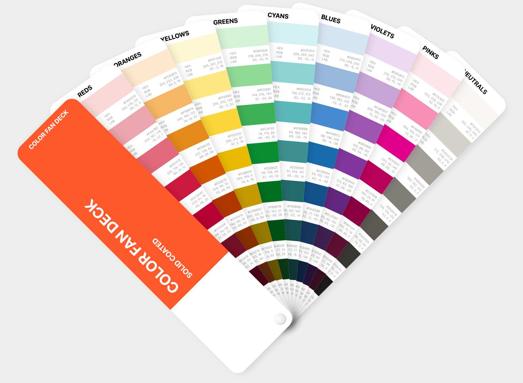
Cool! The cards now fan out from a single point, and the spread adjusts automatically with the container width, but they’re not interactive yet.
Now we have:
Let’s resize the browser:
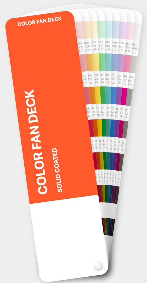
I find this incredibly satisfying!
Click-to-Focus with Exclusive <details>
Here’s where the <details> element earns its place. By giving all color cards name="deck", the browser enforces exclusive accordion behavior:
- Click a card’s summary → it opens (gets the
[open]attribute), any other open card closes automatically. - Click the same summary again → it closes, returning to the default fan.
But the <details> element normally hides its content when closed. We want the color cards to always be visible — the open/closed state should only affect the card’s rotation, not its content visibility. This is where the new ::details-content pseudo-element comes in:
details::details-content {
  content-visibility: visible;
  display: contents;
}
The ::details-content pseudo-element targets the content slot of a <details> — everything that isn’t the <summary>. By overriding content-visibility to visible and setting display: contents, the card’s color list is always rendered, regardless of the open state.
Let’s see how it looks when we select a card:
CSS-Only State Detection
When a card is open, we want three things to happen:
- The active card rotates to 0° (straight up)
- Cards before it collapse toward the start
- Cards after it push toward the end
We need boolean-like flags — 0 or 1 — that each card can use in its rotation formula. And we can set them entirely with CSS selectors:
/* Any card is active */
section:has(details[open]) > * { --has-active: 1; }

/* Cards before the active one */
section > :has(~ details[open]) { --is-before: 1; }

/* The active card itself */
details[open] { --is-active: 1; }

/* Cards after the active one */
details[open] ~ * { --is-after: 1; }
Four selectors, four flags. Let’s unpack them:
section:has(details[open])matches the section when any details child is open, then sets--has-active: 1on all children.:has(~ details[open])matches any element that has a subsequent sibling that isdetails[open]— i.e., it comes before the active card.details[open]matches the active card directly.details[open] ~ *matches all subsequent siblings — the cards after the active one.
The defaults are all 0, set on the base section > * rule. When no card is open, all flags are 0, and the cards fan normally.
The Full Rotation Formula
With the flags in place, the rotation formula handles all states:
section > * {
  rotate: calc(
    (var(--start-degree) + (var(--end-degree) - var(--start-degree))
      * (sibling-index() - 1) / (sibling-count() - 1))
    * (1 - var(--is-active))
    - var(--is-before) * (var(--end-degree) - var(--start-degree))
      * (sibling-index() - 1) / (sibling-count() - 1) * 0.85
    + var(--is-after) * (var(--end-degree) - var(--start-degree))
      * (1 - (sibling-index() - 1) / (sibling-count() - 1)) * 0.85
  );
  transition: rotate .25s linear;
}
So what’s going on?
- Line 1–2: The normal fan rotation — the same formula from before.
* (1 - var(--is-active)): Multiplying by 0 when active zeroes out the rotation — the card snaps to 0°.- Before cards: Subtract a value that pushes them further toward the start. The
0.85factor collapses them tightly but not completely. - After cards: Add a value that pushes them further toward the end, using the inverse position
(1 - progress)so they fan toward the opposite edge.
The transition gives it a smooth, satisfying swing.
The New CSS Features — a Recap
This component leans on several CSS features that are all relatively new — so use a modern browser.
| Feature | What It Does Here |
|---|---|
progress() | Returns 0–1 based on container width, driving the fan spread |
sibling-index() | Each card knows its position — used for rotation and z-index |
sibling-count() | Total number of cards — used to normalize position to 0–1 |
<details name=""> | Exclusive accordion — click to open/close, only one active |
::details-content | Override content visibility so cards always show their colors |
Final Thoughts
I’m constantly blown away by how far CSS has progressed — and is progressing. What I find exciting is how these new features compose. None of them alone are revolutionary — but progress() feeding into sibling-index()-driven rotation, toggled by native <details> state detected via :has() selectors, all without a single line of JavaScript.
Here’s a CodePen demo. I urge you to open it full-screen, resize, click etc.:
{% codepen https://codepen.io/stoumann/pen/zxByRmP %}
Comments
More Blog
View allgemmaFive Gemma-4 models, one accelerator: what porting E2B 31B to AWS Inferentia2 taught me
I ported the whole Gemma-4 family — E2B, E4B, 12B, 31B, and the 26B-A4B MoE — to run on...
X
xbillcommunityHey DEV, I'm Tobore. Let's actually connect.
Hey DEV, I'm Tobore. Let's actually connect. I've been on here for a while now, mostly writing and...
L
Laurina AyarahaiI burned through thousands of AI tokens. Then a friend did it for free
(yep, kinda clickbait, just for the funsies 😊) At the beginning of the year, I relaunched my...
P
Paulo HenriqueaiClaude might be saturating your machine
My laptop was sitting idle with the fan at full tilt. Nothing was running that I knew of. The culprit...
S
Sidhant PandagithubactionsAutomated GitHub Code Reviews Using Google Gemini
I Built a Thing! TL;DR — Google Gemini-based Pull Request reviews and Issue Triaging for...
D
Darren "Dazbo" LesteraiWhat is an "agentic harness," actually?
I've been hearing the word "harness" thrown around a lot lately. I assumed it just meant "the IDE" or...
T
Tilde A. ThuriumReady-made automations for this
Workflows from the Neura Market marketplace related to this DeepSeek resource
- Automate Blog Content Creation with Notion MCP, DeepSeek AI, and WordPressn8n · $9.99 · Related topic
- Generate AI Videos from Scripts with DeepSeek, Synthesia, and Together.ain8n · $24.99 · Related topic
- Compare Multi-Period Financial Data from Google Sheets with DeepSeek AI Analysisn8n · $14.99 · Related topic
- PostgreSQL Conversational Agent with Claude & DeepSeek (Multi-KPI, Secure)n8n · $14.99 · Related topic